Region Button Meter

The Region Button Meter can act as a Region
Button and a Region Meter.
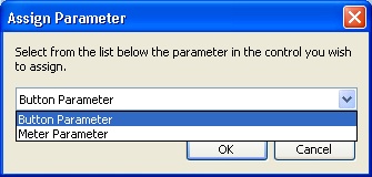
When a control is dropped onto the Region Button Meter
a dialogue box will appear which allows you to select
which parameter to control. For example, the region button
meter can display values as colours like a region meter
and act as a toggle switch like a region button.

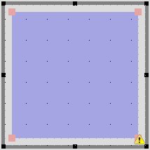
The size and shape of the Region Meter can be changed by moving the red handles which are shown when the object is selected. These turn points can be removed by left clicking on a handle whilst holding the shift key. Turn points may also be added by left clicking on a handle whilst holding the ctrl key, these will appear at a clockwise position from the selected handle.
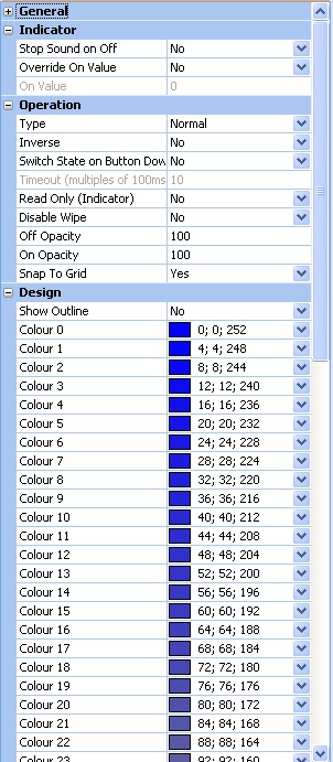
The colour for each binary value of the Region Button Meter can be customized from the properties pane along with the on / off opacity value.
Properties

Stop Sound on Off
Terminates sound when in the Off state.
Override On Value
Changes on value from control default.
On Value
Sets the value to be considered as On.
Type
Sets the type of button to be used. Normal, latching, momentary or timed.
Inverse
Reverses the operation of the button.
Switch State on Button Down
When set to Yes switches the state of the button as soon as the mouse button is pressed.
Timeout (multiples of 100ms)
Sets the delay time before the button changes state.
Read Only (Indicator)
When set to Yes the button will ignore button clicks and act as an indicator only.
Disable Wipe
When set to Yes, wipe will be disabled.
Off Opacity
Sets the opacity of the button in the Off state.
On Opacity
Sets the opacity of the button in the On state.
Snap To Grid
When set to Yes, changes to the size of the button will snap to the nearest grid size.
Show Outline
When set to Yes, the button background will not be visible in design mode.
Colour 0 Through 63
Sets the colour to be displayed when the value is equal to the colour value 0-63.